Diva Darling
- Packaging & Branding Redesign -
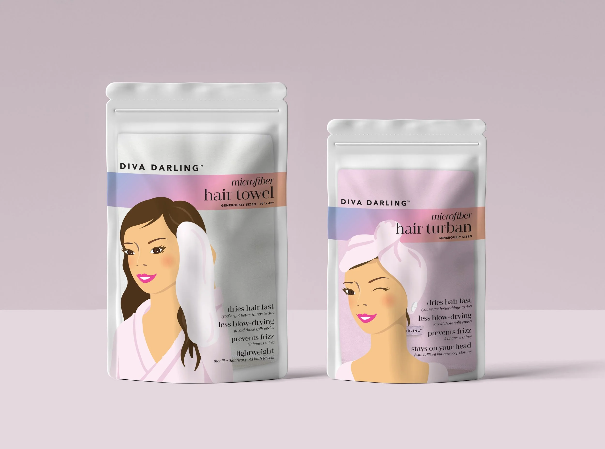
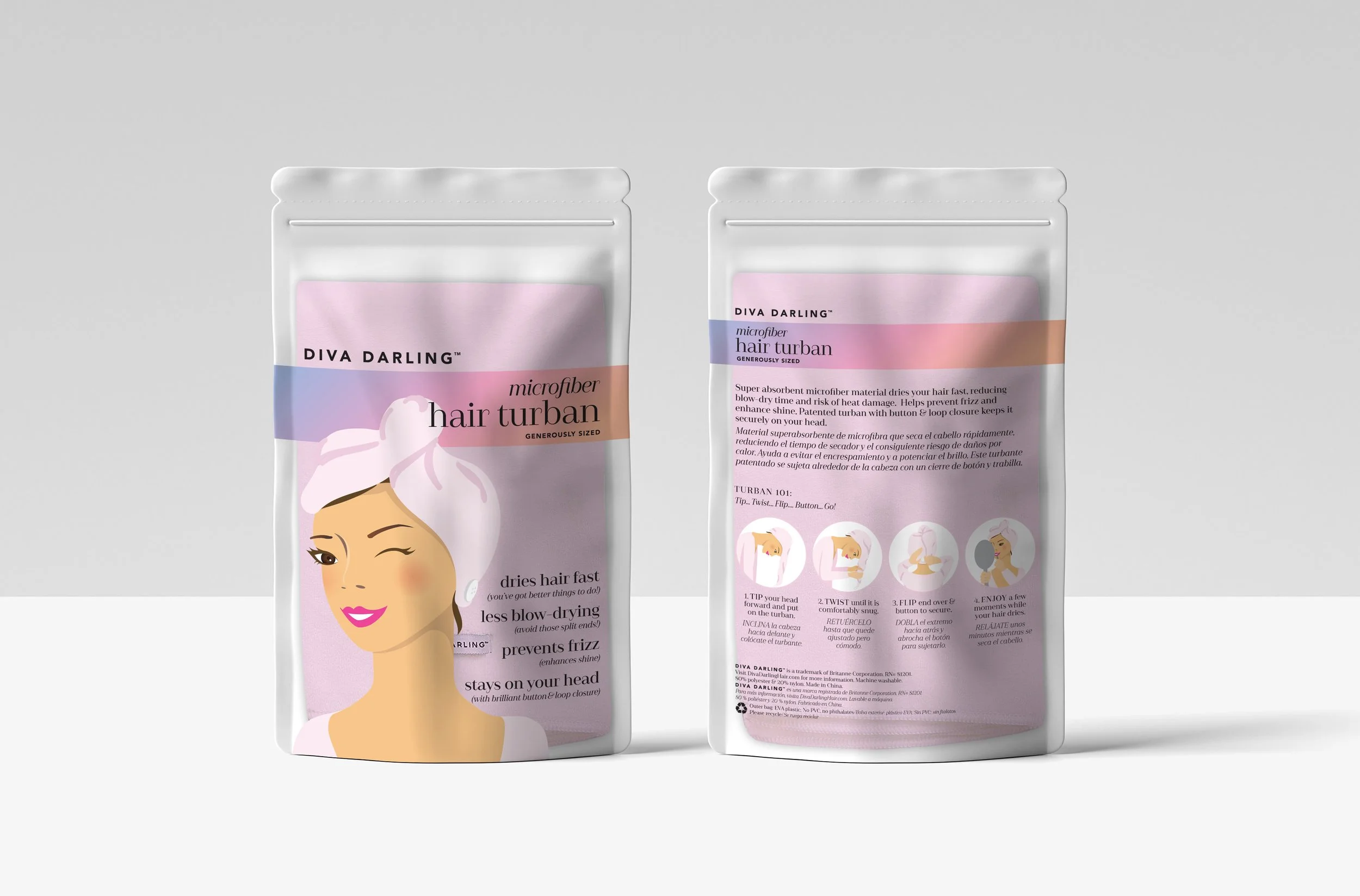
Diva Darling is a sister company of a well known hair towel brand Aquis. Their products were created for a younger audience- mainly targeting teenagers. They hadn’t updated their design in over 10 years and was more than ready for an update. My client wanted to keep the fun, whimsical voice but with a modern and sophisticated twist to it.
< Before >
We kept the idea of an illustration with the towel shown in use, but increased the size and updated the style to be modern and fun, all the while elevating the overall look and color palette. The logo has been simplified to a clean sans-serif typeface, drawing more attention to the product and benefits to better educate the customer on its merits and why their products are superior to others on the market. We opted for a modernized serif typeface that was elegant and playful, and created a layout that is easier to read.


